Utilizing a simplistic design can be a powerful tool in your websites marketing arsinal. Not only can it be cost effective, but it make your website easier to read, promote key content, and provide an overall better user experience. There is a time in a place for fancy graphics but more often than not, less is more. In this article, we will be going into detail on the how and why of simplistic designs.
Why a Simplistic Design Works
Many businesses try to over complicate thier marketing efforts and this also goes for web design. The purpose of a website is to provide a deeper insight into your business while promoting products and services. Anything that strays away from that can be a distraction. Too many fancy graphics and animations can take away from the most important aspects of your website like your call to action or videos and pictures that show people what your business is all about. It can also increase load times which means more of your potential visitors will end up clicking away before your site even finishes loading. Limiting this can lower your bounce rate and also make your customers more likely to click around your site more. Generally, the more time they spend on your site the more likely they will make a purchase.
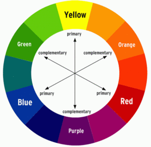
Simplistic websites can also cost far less than more complicated ones. If a simplistic website is more effective and limits cost, this is what you should be doing. This doesn’t mean that you should never have fancy graphics. Infact, when used the correct way they can be highly beneficial. Its when the designer trys to ‘do too much’ when it becomes a problem. Have a few animated elements on your site when it first loads or when the vistor ‘hovers’ but keep it within reason. Don’t be afraid to add some color and some graphics to your site but keep it in moderation. Make sure your menu doesn’t have too many options. Keep it under 7 different options to choose from and use a couple dropdown boxes if necessary. It is important that your website is easy on the eyes and using complementary colors. Pick 2 or maybe 3 colors and stick to them for the rest of your website.

Keep simplicity in mind when building a website or any other type of visual marketing material. Many of the most famous brands around the world use a very simple and easily recognizable logo. Apply this strategy to your website and it will turn into an effective marketing tool that is more cost effective and easy to use. If you need a powerful website for your business and want assistance making it the best it can be Contact Us today. We will be glad to help.

