

Does your website have good content placement? How will this affect the way my audience views my site? These are important questions because you may have a great color scheme and fantastic content but if items are missplaced and messy, your site will come off confusing and unprofessional. In this article I will answer these questions and go in to detail about the concepts of website layout.
This article will be broken down in to two sections
- Desktop layout
- Mobile layout
In order to have a proper website, you must have a responsive design. This means that your website looks good on desktop but is also mobile friendly. To check this, try moving your browser window thinner and wider and see how your site reacts. Does it still look good all the way through the scaling of the window? If so, your site is mobile friendly which is important since most people view websites on their phone. Lets get in to layout.
Desktop Version
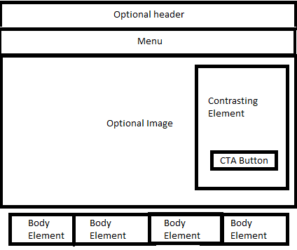
Your websites desktop layout should start with a search bar that goes across the entirety of the window. In certain cases, you may want to add a header above that which also spans across the window although this is not necessary. An example of this would be the Walgreen’s website. Inside your menu you can either list your pages horizontally across the menu or have a drop down sidebar similar to the Walgreen’s example.
After your menu you have a couple of options. In the Walgreen’s example, they simply go in to the main body of their website. The items inside the main body of your site should NOT extend all the way across the screen. Leave about half an inch margin on both sides and keep things centered for the most part. If you choose not to go directly into the main body of your page you can also add a large image directly after the search bar that does extend across the entirety of the window. See BobEvans.com for an example of this. You can then start laying items over top of the image (Call to Action Button). Just be sure that they contrast well. After this point you can start laying elements into the body of your site. In the desktop version of your site, you can lay elements up to five across across.
Mobile Version
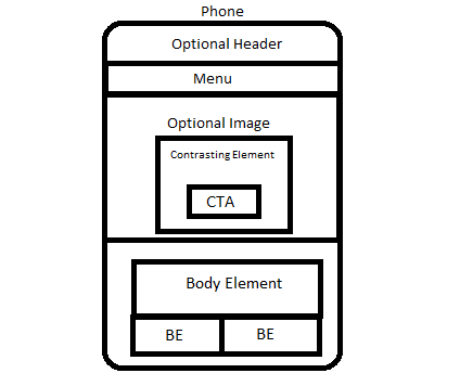
In the mobile version of your site, you will still have a menu bar that goes all the way across the window. The main difference here is that you must use a drop down menu button. Having all of your pages horizontally across the menu bar will make the text too small to read. You may also still want to use an image that spans across the window after the menu bar. The same rules apply here except that the elements you put over the image should be mostly centered. Getting in to the body, you should still have margins on each side of the body elements but just not quite as much. Using half inch margins would squeeze things together too much on a smaller screen. Make sure your body elements are no more than 2 across although for the most part they will be only one across. It is especially important for things to be centered on the mobile version of your site.
These rules are not set in stone and if you feel like breaking the rules because it will make your site better don’t be afraid to do it. If your site is not optimized for both desktop and mobile or your layout is off and would like to have somebody do it for you, reach out to me through the contact us page on my site and I will get back to you as soon as possible. If you would like to talk on the phone about your project call me here (740)409-3030.