Providing a great user experience is essential to having an effective website. Once you have visitors coming to your site, you will want to keep them there until a purchase is made. This is why you, as a business owner, marketer, or web designer must know how your site is viewed. With this knowledge, you will have the ability to not only draw massive amounts of traffic, but keep them on the site for an extended period of time and keep them coming back. The more time a user spends on your site and the more times they keep coming back, the more trust you will build and trust is a necessary component to sales. Below are some important things to keep in mind.
Your Website is not a book
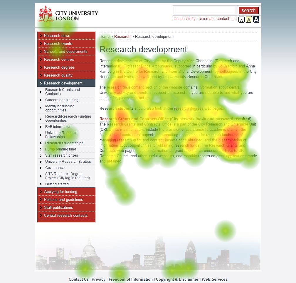
When a visitor comes to your website, more often than not they are aren’t going to read it like a novel. They are going to glance over it similar to how someone would view a magazine. What makes a magazine different from a novel? Imagery! Pictures and videos can say way more about your business than blocks of text that won’t be read by many. Instead of having raw data on your website, you will want to use infographics. Instead of having several paragraphs of text explaining what you do, use a attention capturing video. Make your website look more like a magazine and less like a book. This means having graphics, videos, and complementary colors that draw attention to important information on your site.
Mind the "fold"
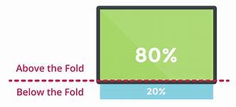
The ‘fold’ of your website is the web browsers bottom border when your website first loads. All of the most important information on your site should be above the fold especially a call to action button. Anything below the fold will require scrolling to become visible. Less important information should be down there. Secondary call to action buttons can be placed throughout the website below the fold so that users who decide to keep scrolling can still take action on your offer easily.

Keep Your Site's Goal in Mind
At the end of the day, your site is another important piece of the sales funnel. Just like the goal of your social media profile should be to get people to your website, the goal of your website should be to get people to buy a product. There may be some secondary goals like getting people on an email list or downloading a free e-book, but the end goal must be kept in mind. Your Call to Action buttons should push the user towards this result. While having fancy graphics can be nice, simplicity is often the best way to achieve a productive and goal-oriented website.
To reiterate, always remember to make your website like a magazine, not a book. Too many words can hurt a website so use videos and pictures to get your point across. Mind the “fold” of your website. Put important content above the fold and secondary content below. Finally, remember the goal of your website and stick to it.


