When it comes to content marketing, your thumbnail can make all the difference. If you ever feel like you’re putting your all into your YouTube video or blog post but it just isn’t getting the recognition it deserves, there may be nothing wrong with the content itself and have more to do with the way it is presented. If your content is never being clicked on in the first place it doesn’t matter how great it is. This is why you need a solid thumbnail for everything you put out. This is something that I have been working on as well. Making your content stand out from the pack on social media platforms can be what makes the difference.
What Makes a Thumbnail Great
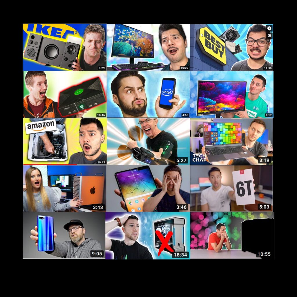
I started my journey of searching for the technique behind the perfect thumbnail by browsing around on YouTube. I looked at what many of the most popular Youtubers in different genres were doing to make their videos stand out. The first thing I noticed was that almost every thumbnail had a face in it. This is because thumbnails that have a human face in them tend to get clicked more often. Even more interesting, the more extreme the expression on the person’s face was, the more clicks it got. Browse through YouTube for a few minutes and you will find numerous examples of this. Of course if the video you are making is more serious in nature, it may be against your interest to make overly expressive faces like this. Secondly, I noticed bright and contrasting colors which draws the viewers eyes to the video. Any text on the thumbnails were contrasting from the background and bold. Check out these thumbnails below as an example.

Faces with exaggerated expressions ✅
Contrasting Colors ✅
Bold Font ✅
Using these 3 key techniques when designing your thumbnail will almost certainly draw more attention to your content. Of course, if your issue is that viewers are clicking away from your content quickly, there may be other reasons to why that is happening such as too much down time, poor editing, or being too clickbaity. Your content should match your title and thumbnail otherwise you will have a very high bounce ratio when your viewers click away after finding out they have been tricked. I build my thumbnails using Adobe Spark. It is free, simple to use and offers a variety of tools to quickly edit your thumbnail image. If you have other suggestions, leave a comment down below.


